What is Pantone Color Guide?
When it comes to the world of design and branding, colors are more than just visual stimuli; they’re powerful tools that can communicate messages, evoke emotions, and define identities. That’s where the Pantone Color Guide steps in. Known as the universal standard for color communication, the Pantone Color Guide is an essential tool for designers across various industries. But what makes it so vital in the realm of branding and design?
Understanding the Pantone Color System
The Pantone Color System is not merely a collection of colors; it’s a comprehensive language used globally to ensure color accuracy and consistency. Imagine trying to describe a specific shade of blue to someone across the world. Without a standardized system, you’d be left with vague descriptions that could easily be misinterpreted. The Pantone Formula Guide Set solves this problem by providing a universal reference that can be understood by anyone in the design and production process.
History of Pantone Color Guides
The story of Pantone begins in the 1960s when Lawrence Herbert, an employee at Pantone, noticed the challenges faced by graphic designers and printers in achieving color consistency. Herbert’s solution was to create a standardized color matching system, which became the cornerstone of today’s Pantone Color System. Over the decades, Pantone has evolved, expanding its color library and improving its color matching technology, cementing its place as a leader in color standardization.
How Pantone Colors are Defined
Pantone colors are meticulously defined using a combination of base pigments. Each color is assigned a unique number, ensuring precise and consistent reproduction. This systematic approach allows designers and manufacturers to communicate exact color specifications without ambiguity. The colors are categorized into various guides, such as the Pantone Formula Guide for spot colors and the Pantone Extended Gamut Guide for broader color ranges, each serving distinct purposes in the design process.
Applications of the Pantone Color Guide
The Pantone Color Guide’s applications stretch far and wide, becoming an indispensable tool in industries ranging from fashion to interior design. However, its most profound impact is found in branding and logo design.
Pantone in Branding
Selecting the right Pantone color for a brand is akin to choosing the right tone of voice for a speech. It’s not just about aesthetics; it’s about resonance. Brands like Tiffany & Co. have their signature colors, and the importance of Pantone in branding is evident in their ability to create immediate recognition and emotional connection. The right Pantone color can convey values, inspire trust, and set a brand apart from competitors.
Color Matching in Print and Digital Media
In both print and digital media, accurate color matching is crucial. A color that looks perfect on a computer screen might not translate the same way in print. This is where the Pantone Color Guide shines. By providing exact color specifications, Pantone ensures that designs maintain their intended look, whether on a business card or a billboard. The guide is a cornerstone for achieving consistency across various mediums.
Choosing the Right Pantone Color
Selecting the right Pantone color can be a daunting task, but with the right strategies, it becomes a rewarding process that enhances brand identity.
Considerations for Color Psychology
Colors can influence perception and behavior, which is why understanding color psychology is vital. For instance, blue often evokes trust and calmness, making it a popular choice for financial institutions. When choosing Pantone colors, it’s important to consider the emotional impact they will have on your audience. This can guide the selection process and ensure the colors align with the brand’s message and goals.
Tools and Resources for Designers
Designers have a plethora of tools at their disposal to help with Pantone color selection. Software like Adobe Creative Cloud integrates Pantone libraries, allowing designers to experiment and visualize their choices. Additionally, resources like the Pantone Colour Chart provide an easy way to explore and compare different shades. These tools empower designers to make informed decisions and create harmonious color palettes.
Conclusion
In the world of design and branding, the Pantone Color Guide stands as a beacon of precision and consistency. Its ability to standardize colors across various applications makes it an invaluable asset for designers and brands alike. Whether you’re crafting a logo or developing a marketing campaign, the Pantone Color Guide ensures that your colors speak the intended language and leave a lasting impression.
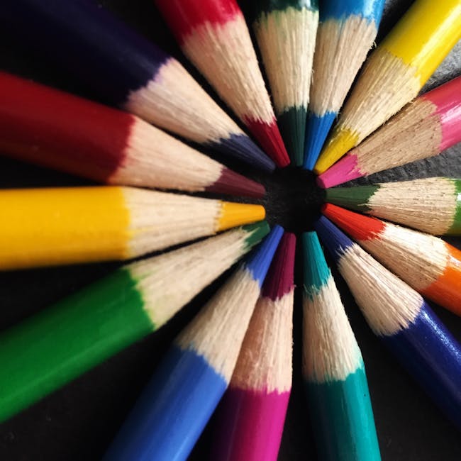
 Photo by Naomi Bokhout