What is Hierarchy Illustration?
Hierarchy illustration is a foundational concept in design that plays a pivotal role in visual communication, especially in brand and logo design. Imagine entering a crowded room where everyone is talking at once. Chaos, right? Hierarchy illustration helps cut through the noise, guiding your eyes to what matters most. By using visual cues like size, color, and contrast, designers can direct attention, create a sense of order, and enhance the overall clarity of their message.
Understanding Hierarchy in Design
Hierarchy in design is like a conductor leading an orchestra. It ensures that each element plays its part beautifully, contributing to a harmonious composition.
Definition of Design Hierarchy
At its core, design hierarchy is about organizing elements based on their importance. It’s the thoughtful arrangement of visual information to guide the viewer’s eye from the most significant to the least crucial elements. Components such as size, color, and positioning work together to create a visual path for the audience to follow.
Importance of Hierarchy in Visual Communication
Visual communication thrives on clarity, and hierarchy is its backbone. It helps convey messages succinctly and effectively by prioritizing information. When used correctly, hierarchy can transform a cluttered design into a clear narrative, making the viewer’s experience seamless and engaging. According to Moonlight Creative, understanding the importance and sequence of elements can dramatically influence how your message is perceived.
Elements of Hierarchy Illustration
Creating an effective hierarchy involves a careful selection of design elements that work in harmony. Here’s a look at what makes hierarchy illustration come alive.
Size and Scale
Size isn’t just about making things bigger. It’s about drawing attention. Larger elements naturally catch the eye first, establishing their importance. Consider a billboard where the headline dwarfs everything else. The message is clear: start here.
Color Usage
Color is a powerful communicator. It can evoke emotions, highlight crucial elements, and create contrast. Bold colors can grab attention, while softer tones can recede into the background. For insights on how color can shape perception, check out Flux Academy’s blog on visual hierarchy.
Contrast and White Space
Contrast is the yin to white space’s yang. Together, they create balance and emphasis. Contrast can highlight critical elements, while white space offers breathing room, preventing visual overload. This duo ensures that your design feels both dynamic and spacious.
Applications of Hierarchy Illustration in Branding
In the branding world, hierarchy illustration is indispensable. It helps brands communicate their identity clearly and effectively.
Case Studies of Effective Branding
Successful brands like Apple and Nike exemplify hierarchy illustration. Their logos and advertisements are a masterclass in simplicity and focus, directing attention to the core message. CorelDRAW’s guide on graphic design principles offers more examples of how brands use hierarchy to their advantage.
Common Mistakes in Hierarchy Illustration
Designers often fall into traps like overcomplicating layouts or ignoring the significance of white space. The result? A confusing message that fails to engage. Avoiding these pitfalls requires a keen understanding of hierarchy principles and a disciplined approach to design.
Creating Effective Hierarchy Illustrations
Crafting a compelling hierarchy illustration requires a mix of skill, creativity, and the right tools.
Tools and Software for Hierarchy Illustration
Adobe Illustrator, Sketch, and Canva are popular choices among designers. These tools offer features that help create precise and impactful hierarchy illustrations. Canva’s guide on visual hierarchy is a resourceful starting point for beginners.
Best Practices for Designers
To achieve optimal results, designers should focus on the essentials: clarity, simplicity, and consistency. Prioritize elements based on their importance, maintain a clean layout, and ensure that all elements work cohesively to support the overall message.
Conclusion
Hierarchy illustration is more than just a design technique; it’s a storytelling tool that guides viewers through a visual journey. By understanding and applying the principles of hierarchy, you can create designs that not only captivate but also communicate effectively. Whether you’re working on a brand logo or a complex infographic, let hierarchy illustration be your guide. As you embark on your next project, remember that every element plays a part in the bigger picture.
 Photo by Google DeepMind
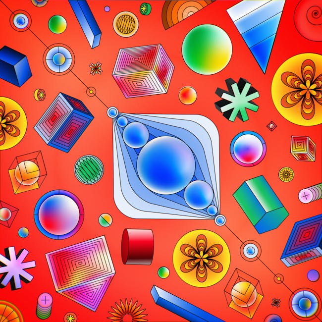