What is Fall Photo Color Scheme?
Every autumn, nature puts on a breathtaking display of colors that captivates our senses. These vibrant hues hold the power to transform ordinary photos into extraordinary visual stories. But what exactly is a “Fall Photo Color Scheme,” and why does it matter in branding and logo design? In this article, I’ll explore the rich colors of fall and their potential to enhance both personal photography and professional branding.
Understanding the Fall Color Palette
The fall color palette is a mesmerizing blend of nature’s most stunning shades. These colors aren’t just for admiring; they have profound emotional impacts that can elevate your brand’s visual identity or create a nostalgic photograph.
Common Fall Colors
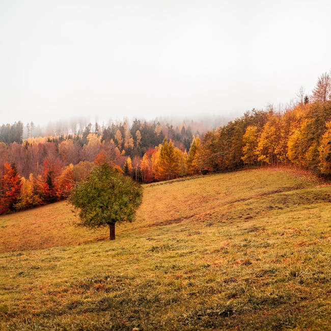
When thinking of fall, certain colors immediately come to mind. Burnt orange, reminiscent of pumpkins and autumn leaves, brings warmth and vibrancy. Deep reds conjure images of crisp apples and scarlet foliage. Mustard yellows mimic the golden glow of a harvest field, while earthy browns ground these vivid tones in nature’s steady embrace. For more ideas on how these colors blend beautifully, check out Looka’s collection of fall color palettes.
Emotional Associations of Fall Colors
The colors of fall evoke feelings of warmth, nostalgia, and comfort. Imagine wrapping yourself in a soft blanket on a chilly evening; that’s the same comforting feeling these colors can convey. They remind us of cozy moments and gatherings with family and friends. For some creative ways to incorporate these colors into your photography, visit Sunshine and Shadows Photography.
Integrating Fall Colors in Branding
Brands can harness the emotional power of fall colors to create a compelling visual narrative. Here’s how you can weave these hues into your company’s identity.
Logo Design Considerations
Choosing the right fall colors for your logo can be a strategic decision. Colors like deep reds and burnt orange can signify passion and creativity, while earthy browns and mustard yellows can convey trust and reliability. Consider the personality traits you want your brand to embody; you can find inspiration in a balanced autumn color palette from Selah Creative Co..
Packaging and Marketing Materials
Fall colors are not just for logos; they can be beautifully integrated into packaging and marketing materials. A well-thought-out color scheme can make your product stand out on the shelf and create a memorable first impression. By using these colors consistently, your brand can communicate its values effectively. For more ideas on the use of fall colors, Offeo offers some fantastic inspiration.
Tips for Capturing Fall Colors in Photography
Photography is an art, and using the fall color scheme can elevate your images to new heights. Here are some tips for taking advantage of autumn’s visual bounty.
Best Times for Fall Photography
Timing is everything when it comes to capturing the rich colors of fall. The golden hour, shortly after sunrise or before sunset, offers soft light that enhances the warm tones in your photos. For photographers looking to make the most of this magical time, Dazzling Diva Photography provides insights into selecting the perfect palette for your outdoor family sessions.
Editing Techniques to Enhance Fall Colors
Enhancing fall colors in your photos doesn’t have to be complicated. Simple editing tools can amplify the natural beauty of your images. Adjusting contrast and saturation can make the colors pop without losing their natural feel. For those looking to refine their skills, a detailed guide on editing techniques can be found at Venngage.
Conclusion
Incorporating a Fall Photo Color Scheme into both branding and photography provides a unique opportunity to connect with audiences on a deeper emotional level. These colors offer warmth, nostalgia, and comfort, making them perfect for establishing a memorable brand identity or capturing the essence of the season in your photos. Whether you’re designing a logo, creating marketing materials, or capturing the perfect photo, the fall color palette is a rich resource waiting to be explored.
 Photo by Simon Berger