What is Color Saturation Photoshop?
Color saturation in Photoshop is like the spice in a well-cooked meal; it enhances the flavor and brings out the vibrancy of the dish. Similarly, saturation impacts how vivid and intense the colors are in your digital designs. As a designer, understanding and mastering this concept is crucial for creating striking and memorable visuals. In this post, I’ll walk you through the essentials of color saturation in Photoshop, its importance in design, and practical steps to adjust it effectively in your work.
Understanding Color Saturation
To fully appreciate the power of color saturation, it’s important to grasp its definition and role in design. Whether you’re creating a logo or an advertisement, saturation plays a key role in how the audience perceives your work.
What is Color Saturation?
Color saturation refers to the intensity or purity of a color. In simpler terms, the more saturated a color is, the more vivid and bright it appears. Conversely, desaturated colors look dull and muted. Photoshop allows us to control saturation to enhance the visual appeal of an image. You can learn more about the basics of saturation in this helpful article.
The Role of Color Saturation in Design
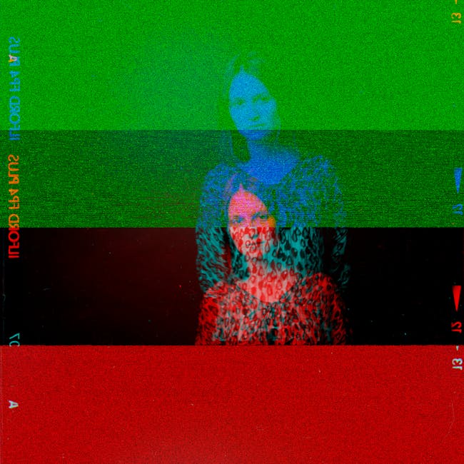
In the world of branding and logo design, color saturation is a powerful tool. It influences how a design is perceived and can evoke specific emotions. For instance, a highly saturated color can grab attention and convey energy, while softer, desaturated hues might evoke calmness and sophistication. Understanding how saturation affects perception is crucial for fine-tuning your brand’s aesthetics.
How to Adjust Color Saturation in Photoshop
Photoshop offers several methods to adjust color saturation, each with its unique features and benefits. Let’s explore some of the most effective tools for this task.
Using the Hue/Saturation Adjustment Layer
The Hue/Saturation adjustment layer is one of the most straightforward ways to tweak saturation in Photoshop. Here’s how you can use it:
-
Open your image in Photoshop.
-
Navigate to the Layers panel and click on the ‘New Adjustment Layer’ icon.
-
Select ‘Hue/Saturation’.
-
In the Properties panel, adjust the Saturation slider to increase or decrease the intensity of colors.
This method allows you to control saturation non-destructively, meaning you can revisit and adjust your changes anytime. For a more detailed guide, check out this tutorial.
Adjusting Saturation with the Vibrance Tool
Unlike the Saturation slider, the Vibrance tool is designed to adjust saturation with a focus on preserving skin tones, making it ideal for portraits. It increases the saturation of less-saturated colors more than already saturated colors, allowing for a more subtle enhancement. Use it when you want to make colors pop without over-saturating certain elements.
Utilizing the Color Balance Tool
The Color Balance tool offers another way to adjust saturation indirectly by shifting the color balance towards complementary colors. This method is particularly useful for creating specific moods or correcting color casts in an image.
-
Go to ‘Image’ > ‘Adjustments’ > ‘Color Balance’.
-
Adjust the sliders for Shadows, Midtones, and Highlights to achieve the desired effect.
Practical Tips for Working with Color Saturation
With the right approach, saturation adjustments can take your design work to the next level. Here are some practical tips to keep in mind.
Choosing the Right Saturation Levels for Your Brand
Selecting the appropriate saturation levels is essential in maintaining brand identity. Consider what emotions you want your brand to evoke and adjust saturation accordingly. A vibrant, highly saturated logo might suit a youthful brand, while a more subdued palette could align with a luxury brand’s image.
Common Mistakes to Avoid
Avoid these common pitfalls when working with color saturation:
-
Over-Saturation: It’s easy to go overboard. Excessive saturation can make an image look unnatural or jarring.
-
Ignoring Context: Always consider the context in which the image will be viewed. A design that looks great on a screen might not have the same impact in print.
-
Inconsistent Use: Maintain consistency in saturation levels across your brand materials to ensure cohesion.
Conclusion
Color saturation in Photoshop is more than just a technical tool—it’s an art. From adjusting the vibrancy of a brand logo to enhancing the mood of a scenic photo, mastering saturation can make your designs truly stand out. I hope this guide has equipped you with the knowledge to experiment confidently with color saturation in your projects. Remember, like any great chef, the key is in the balance. So go ahead, adjust those sliders, and see what exciting creations you can bring to life.
 Photo by Alexey Demidov