What is Burnt Orange Color Palette?
The burnt orange color palette is more than just a hue; it’s a vibrant expression of warmth and creativity. This palette has carved its niche in the design world, becoming a popular choice for brands seeking to exude confidence and approachability. Whether in logos, advertisements, or interior design, burnt orange offers a rich, captivating appeal that catches the eye and stirs emotions.
Understanding the Burnt Orange Color
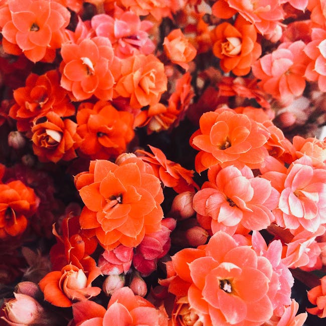
Burnt orange is a striking blend of orange and brown, creating a hue that is both bold and earthy. It originated from the natural colors of autumn leaves and sunset skies, evoking feelings of warmth and comfort. Burnt orange is perceived as friendly yet assertive, making it a versatile choice in various design applications.
Historical Context
The history of burnt orange in art and design can be traced back to its use in ancient pottery and textiles. Over the centuries, it evolved as a symbol of rustic elegance, often featured in traditional and bohemian styles. Its resurgence in modern design highlights its timeless appeal and adaptability to contemporary aesthetics.
Psychological Impact
Colors can evoke emotions, and burnt orange is no exception. It is known to inspire enthusiasm, creativity, and warmth. In branding, it can create an inviting yet bold image, appealing to consumers’ emotions and fostering a sense of loyalty and trust. The psychological effects of burnt orange make it ideal for brands looking to stand out in a competitive market.
Using the Burnt Orange Color Palette in Design
Incorporating burnt orange into your design projects can transform your visual communication. Its versatility allows it to blend seamlessly with various styles, from minimalist to maximalist.
Complementary Colors
Burnt orange pairs beautifully with a range of colors. Dark blues and grays complement it well, creating a sophisticated contrast that enhances its vibrancy. For a more lively palette, consider pairing it with mint green and peach. These combinations can be perfect for creating dynamic and engaging designs. Explore more color inspirations.
Best Applications
This color finds its strength in diverse applications. In logos, burnt orange can convey energy and innovation. Advertisements utilizing this color often capture attention effortlessly, while websites using burnt orange elements can create a warm and welcoming user experience. Its adaptability makes it a valuable asset in any designer’s toolkit.
Case Studies of Successful Use
Brand Examples
Several brands have successfully incorporated burnt orange into their identity. For instance, Canva has highlighted how this color can be used effectively across different media. It provides a sense of energy and approachability without overwhelming the viewer.
Impact on Audience Engagement
The strategic use of burnt orange has been shown to enhance audience engagement. By fostering an emotional connection, brands leveraging this hue often see increased loyalty and interaction. The warmth and vibrancy of burnt orange can transform a brand’s image, making it memorable and impactful.
Trending Color Combinations with Burnt Orange
Seasonal Trends
Burnt orange has become synonymous with autumn, evoking thoughts of falling leaves and cozy warmth. Seasonal designs often feature this color, creating an ambiance that resonates with the time of year. Its ability to convey seasonal emotions makes it a popular choice for autumn-themed marketing campaigns.
Fashion and Interior Design
In fashion, burnt orange is a staple for fall collections, offering a pop of color that’s both stylish and comforting. In interior design, it’s often used to create inviting spaces, adding a touch of sophistication with its earthy tones. Whether in a cozy living room or a fashionable outfit, burnt orange makes a statement.
Conclusion
The burnt orange color palette is a powerful tool in the world of design. Its rich history, emotional impact, and versatility make it a favorite among brands and designers alike. By understanding how to effectively use burnt orange, you can harness its potential to create designs that are both compelling and memorable. Whether you’re crafting a brand identity or designing a cozy living space, burnt orange offers a timeless allure that captivates and inspires.
 Photo by Juan Sauras