What is Brand Image Typography?
Typography is more than just arranging letters on a page. In the world of branding, it holds the power to connect deeply with an audience, shaping perceptions and creating lasting impressions. Let’s explore what brand image typography truly means and its pivotal role in crafting a brand’s identity.
Understanding Brand Image Typography
The Importance of Typography in Branding
Typography is often the unsung hero of branding. It silently influences how we perceive and remember brands. The right font can convey stability, elegance, or even playfulness. It sets the tone before any words are read, establishing an immediate connection. According to Parisleaf, typography helps in creating distinction, consistency, coherence, and effective communication within a brand’s messaging.
Elements of Typography in Brand Image
When it comes to typography within a brand, every element counts. Font choice is critical; a serif font can imply tradition, while a sans-serif might suggest modernity. Size and spacing also play roles in readability and emphasis, while color can evoke specific emotions. These elements combine to create an image that aligns with the brand’s ethos and captivates its audience.
Choosing the Right Typography for Your Brand
Font Families and Their Impact
Choosing the right font family involves understanding the psychological impact of different fonts. Serif fonts, with their classic look, are usually seen as authoritative and reliable. Sans-serif fonts, on the other hand, offer a clean, modern aesthetic. Script fonts can add a personal or luxurious touch. Each of these choices has implications for how a brand is perceived, as DesignRush highlights.
Consistency Across Digital and Print Media
Typography should be consistent across all brand touchpoints, whether digital or print. A mismatch between online and offline materials can confuse audiences and dilute brand identity. Consistency ensures that regardless of where a consumer encounters the brand, they receive the same message and visual experience.
Case Studies: Successful Brand Image Typography
Analysis of Iconic Brands
Brands like Apple, Coca-Cola, and Nike are excellent examples of effective typography use. Apple’s sleek, minimalist typeface reflects its innovative and user-friendly approach. Coca-Cola’s classic script has become synonymous with its brand heritage and tradition. Nike’s bold typeface communicates strength and motivation. These companies show how typography can enhance a brand’s image and market presence.
Lessons Learned from Typography Failures
Not all typography choices resonate well. There are instances where poor font selection has negatively impacted brand perception. A font that doesn’t align with the brand’s message or appears outdated can deter potential customers. Recognizing these pitfalls is crucial in maintaining a strong brand identity.
Trends in Brand Image Typography
The Rise of Custom Typefaces
Creating custom typefaces is becoming a popular trend. It allows brands to have unique visual elements that set them apart from competitors. Customization offers a personalized touch, making the brand instantly recognizable and memorable.
Minimalism in Typography
Minimalism in typography is gaining traction. Consumers today are drawn to clean, straightforward designs that communicate messages quickly and effectively. This trend aligns with the fast-paced nature of modern consumer behavior, where simplicity often wins over complexity.
Conclusion
Brand image typography is a powerful tool in the world of branding. It shapes perceptions, influences emotions, and creates lasting impressions. As brands evolve, so too should their typographic choices, ensuring they resonate with their audience and reflect their core values. As we see from both successful and failed examples, thoughtful typography is a cornerstone of an effective branding strategy. For anyone involved in brand design, considering typography seriously is not just an option—it’s a necessity.
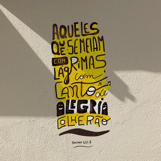
 Photo by Edward Eyer