How to Create a Logo for My Own Colorblock Style
Colorblock style in logo design is not just vibrant; it's a visually striking choice that conveys modernity and creativity. As an entrepreneur or small business owner, a well-crafted logo can significantly elevate your brand identity and attract your target audience. Let’s dive into how you can create a logo that embodies the Colorblock style, making your brand not just seen but remembered.
Understanding Colorblock Style in Logo Design
What is Colorblock Style?
Colorblock style is characterized by the use of bold colors and geometric shapes that evoke a sense of energy and creativity. Originating from various design movements like Pop Art and Minimalism, Colorblock style emphasizes simplicity while making a statement. This style beautifully communicates the essence of your brand—dynamic and contemporary. Think of it as a palette of emotions splashed across your logo, inviting viewers in and creating a connection.
Characteristics of Colorblock Logos
When you think Colorblock, envision bright, contrasting colors arranged neatly within geometric forms. Here are some key features that make Colorblock logos distinctive:
- Bold Color Use: Colors are not just for aesthetics; they communicate feelings and concepts. A Colorblock logo typically uses high-contrast colors to create visual appeal.
- Geometric Shapes: Geometric forms like rectangles and circles add structure and modernity to the overall design.
- Simplicity: Despite the eye-catching colors, the design remains uncomplicated, making it easy to recognize and remember.
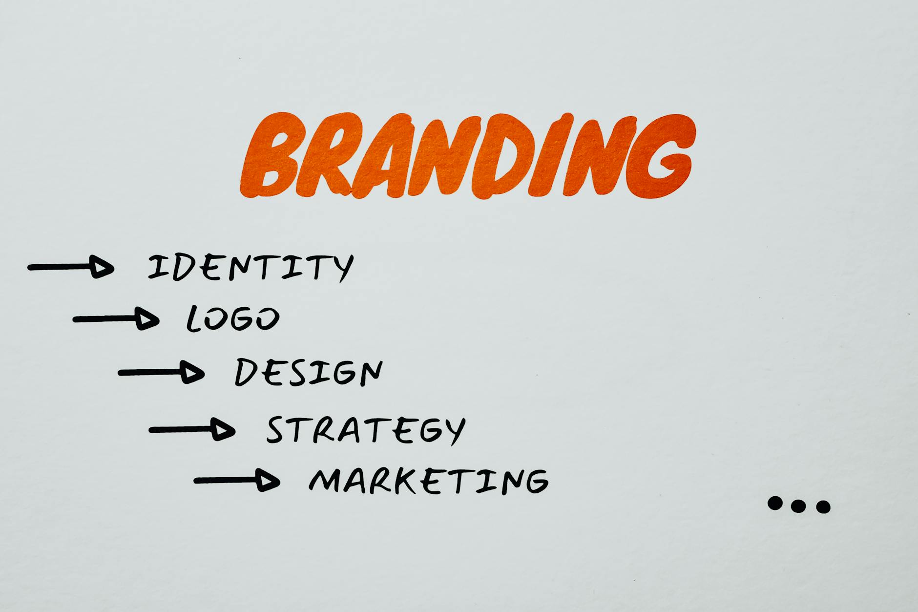
Photo by Eva Bronzini
Steps to Create Your Colorblock Logo
Creating a Colorblock logo is a journey that involves several clear steps. Below, I've outlined the process to guide you through:
Define Your Brand Identity
Understanding what your brand stands for is crucial. What values do you want your logo to reflect? Who is your target audience? Take time to brainstorm these elements. Consider your brand’s personality and how a Colorblock style resonates with your mission. This foundational understanding will inform your design decisions later.
Choose the Right Colors
Color selection is vital in Colorblock design. Colors evoke emotions and associations. Use tools available on Logo Maker Shop to explore color palettes that fit the Colorblock style. Consider how each color complements or contrasts with one another, and think about the message you want to communicate.
Select Shapes and Layout
Geometric shapes are integral to the Colorblock aesthetic. Use square and rectangular forms to create a visually balanced layout. Think of how you can arrange these shapes creatively while keeping the design clean. Experimentation is key, so don’t hesitate to try different combinations until you find what feels right for your brand.
Utilize the Logo Maker Shop
The Logo Maker Shop is an excellent tool for designing your Colorblock logo. This user-friendly platform enables you to customize your design seamlessly. Utilize its features to adjust colors, shapes, and texts until your logo embodies your brand identity perfectly.
Refine Your Design
Once your initial design is complete, it’s important to refine it. Gather feedback from friends, colleagues, or potential customers. Assess if the logo aligns with your brand identity and resonates with your target audience. Small tweaks can make a big difference, so don’t rush this stage.
Common Mistakes to Avoid
Even the most creative among us can stumble during the design process. Here are some pitfalls to watch out for:
Overcomplicating the Design
Simplicity is key in Colorblock logos. Avoid cramming in too many elements. A successful design should be straightforward yet striking. Remember, the goal is for your audience to recognize and remember your logo at a glance.
Inconsistent Branding
Your logo will be featured across various marketing materials. Ensure that your Colorblock logo remains consistent with your brand identity—this helps reinforce brand recognition. Use the same color palette and shapes throughout your promotional items like business cards, websites, and social media profiles.
Examples of Colorblock Logos
Learning from others can be inspiring. Here are successful Colorblock logos that exemplify effective design principles:
Case Study 1: Successful Brand A
Brand A utilizes a vibrant color palette featuring blue and orange blocks, coupled with clean geometric lines. This combination offers a refreshing look that captures attention and conveys energy. Their logo is memorable, making it easy for customers to associate it with their brand values of innovation and creativity.
Case Study 2: Successful Brand B
Another great example is Brand B, which uses an angular design with overlapping, semi-transparent shapes in bold colors. This not only creates depth but also highlights the brand's forward-thinking ethos, making it an excellent representation of the Colorblock style.
Final Thoughts on Creating a Colorblock Logo
Creating a Colorblock logo is an exciting process that reflects the essence of your brand. From defining your brand identity to selecting the right colors and shapes, each step contributes to developing a memorable logo. Don’t forget to utilize tools like the Logo Maker Shop to streamline your design process. With the right approach, your Colorblock logo will not only stand out but will also resonate with your audience, strengthening your brand identity in the marketplace. Now, what are you waiting for? It's time to dive in and create your very own Colorblock masterpiece!

Michael Harper is a Senior Content Strategist at MarketInsider.co, a premier source for insights on digital marketing and business trends. With over 15 years of expertise in content development and strategic communications, Michael is renowned for his ability to craft compelling narratives that resonate with diverse audiences. He holds a Bachelor’s degree in Journalism from New York University and a Master’s degree in Business Administration from Columbia Business School. Outside of work, Michael is passionate about historical literature and enjoys hiking the trails of the Pacific Northwest.


