How to Create a Logo for My Own Bold Typography Style
Creating a logo is one of the most critical steps you can take when establishing your brand. A well-designed logo reflects your identity and helps you stand out in a crowded marketplace. Particularly, utilizing bold typography can result in a powerful and memorable logo. So, let’s explore how you can undertake this creative journey on your own without needing to hire a professional designer.
Introduction to Bold Typography Logo Design
Imagine walking into a crowded room, and a bright, bold sign captures your attention immediately. That’s the power of bold typography—it’s visually appealing and speaks volumes about your brand. By engaging with bold fonts, you can create a striking logo that resonates with your audience, accentuating your brand's confidence and strength. With this guide, you will learn how to design a logo featuring bold typography, step by step.
Understanding Bold Typography in Logo Design
Definition of Bold Typography
Bold typography refers to the use of thick, prominent letters designed to stand out. These letters often convey strength and clarity, ensuring visibility even from a distance. Think of logos from iconic brands like Coca-Cola or Vogue; they effectively utilize bold typography to reinforce their brand identities.
Impact of Bold Typography on Brand Identity
Bold typography does more than just look good—it encapsulates your brand’s message. It communicates confidence and reinforces recognition. A bold typeface helps your audience remember your brand more easily. It's like a friendly handshake that welcomes people in with assurance and familiarity.
Steps to Create a Logo with Bold Typography
Now that you’ve got a grip on what bold typography is and why it matters, let’s break down the steps to create your own logo.
Define Your Brand Identity
Before diving into design, clarify what your brand stands for. What's your mission? What values will guide you? Your logo should reflect this identity. Ask yourself:
- What do I want my customers to feel when they see my logo?
- How do my products or services embody what I stand for?
Understanding these aspects will ground your design choices and lead to a more meaningful logo.
Research and Gather Inspiration
Surround yourself with bold typography logos you admire. Browse design blogs, Pinterest boards, or platforms like Behance for inspiration. You might create a mood board to collect images, colors, and typography that resonate with your vision for your logo.
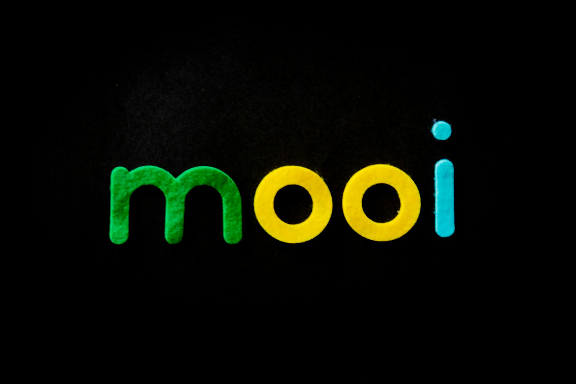 Photo by Magda Ehlers
Choose the Right Typography
Selecting the right typeface is crucial. Look for fonts that embody your brand’s character. Whether you’re going for a modern look or a classic feel, ensure the typography is clear and supports your brand identity. You might want to stick with sans-serif fonts for a contemporary look or serif fonts for a more traditional appeal.
Utilize Logo Maker Shop for Design
To simplify this process, consider using the Logo Maker Shop. This tool allows you to experiment with various templates and styles easily. You can play around with different fonts and see how bold typography looks in practice. The flexibility offered by this platform can help you find a design that truly speaks to your brand.
Refining Your Design
Once you have a draft of your logo, don’t hesitate to seek feedback. Share your design with friends or colleagues and ask for their thoughts. Be open to revisions based on constructive criticism. It’s a great chance to refine your logo and make sure it communicates exactly what you want.
Finalizing Your Logo
After incorporating feedback, review your design thoughtfully. Ensure it resonates with your brand identity and works for various applications, from business cards to websites. Double-check the visibility and clarity at different sizes. Once satisfied, save your logo in multiple formats, ensuring it’s ready for both print and digital use.
Best Practices for Bold Typography Logos
To ensure the effectiveness of your bold typography logo, keep the following tips in mind:
Keep It Simple
Simplicity is key in design. Aim for a clean and straightforward logo that avoids unnecessary detail. This approach will help your audience remember your logo more easily.
Ensure Scalability
Your logo should look good at any size. Whether it’s on a small business card or a large billboard, make sure it remains clear and recognizable.
Color Choices for Bold Typography
Consider the colors used in your logo carefully. Colors evoke emotions and can deepen the connection with your audience. Use color theory to select hues that represent your brand personality. For example, blue typically conveys trust, while red can indicate passion or urgency.
Real-Life Examples of Successful Bold Typography Logos
Case Study: Successful Brands
Look to successful brands that utilize bold typography in their logo designs. For example, think about brands like FedEx and Google. They use bold typefaces to convey clarity and trust in their services. Exploring their logos might inspire your design process.
Lessons Learned from the Examples
Key takeaways from these examples include:
- The effectiveness of simplicity in design
- The importance of consistency with brand identity
- How bold typography reinforces recognition and recall
Conclusion: Your Bold Typography Logo Journey
You're now equipped with the knowledge to embark on the exciting journey of designing your own bold typography logo. By focusing on what your brand represents and engaging with the creative process, you can develop a logo that speaks volumes.
Final Thoughts on Creating Your Bold Typography Logo
Creating a logo with bold typography not only enhances your brand identity but also sets the stage for recognition. Utilize the resources available to you, such as the Logo Maker Shop and the tips mentioned here, to bring your vision to life. Dive in, explore your creativity, and let your logo reflect the essence of your brand!

Michael Harper is a Senior Content Strategist at MarketInsider.co, a premier source for insights on digital marketing and business trends. With over 15 years of expertise in content development and strategic communications, Michael is renowned for his ability to craft compelling narratives that resonate with diverse audiences. He holds a Bachelor’s degree in Journalism from New York University and a Master’s degree in Business Administration from Columbia Business School. Outside of work, Michael is passionate about historical literature and enjoys hiking the trails of the Pacific Northwest.


