Drugstore Industry Logo Design Ideas
In the dynamic world of the drugstore industry, your logo isn't just a pretty picture; it's the face of your brand. An effective logo fosters brand recognition and builds trust with customers. It conveys your values and mission at a glance and sets you apart in a crowded market. This guide will explore essential design ideas and techniques tailored specifically for drugstore logos, providing the inspiration you need to create a memorable brand identity.
Key Characteristics of Drugstore Industry Logos
When it comes to designing a logo for a drugstore, certain characteristics help convey the right message. Here are pivotal traits to consider:
Color Psychology in Drugstore Logos
Color plays a crucial role in logo design, especially in the drugstore industry. Colors like green and blue are often preferred as they evoke feelings of health and trust. Green suggests a connection to nature and wellness, while blue represents reliability and safety. By thoughtfully selecting your color palette, you can reflect your brand's ethos and appeal to your customers' emotions.
Symbolism and Imagery
Imagery is another powerful tool in logo design. Common symbols associated with pharmacies include:
- Crosses: These symbolize healthcare and wellness.
- Pills or capsules: They underline the core business focus on medication.
- Leaves or natural elements: These represent the health and wellness aspect, linking to holistic care.
Incorporating recognizable symbols into your logo can enhance familiarity and establish a sense of security for your customers.
Typography Choices
The font you choose for your logo can communicate its personality. Serif fonts often convey reliability and professionalism, while sans-serif fonts tend to appear modern and approachable. Opting for clean and easily legible typography ensures that your logo stands out and is remembered. A well-chosen font can reflect the message of safety and care that is central to any drugstore brand.
Ideation Techniques for Drugstore Logos
Generating creative ideas for your drugstore logo can be an exciting process! Here are some actionable techniques to get you started:
Conducting Market Research
Before diving into design, analyze competitor logos and current market trends. Consider what works for them, what doesn't, and how you can differentiate your brand. This research will provide insight into customer preferences and expectations, helping you create a logo that resonates with your target audience.
Incorporating Customer Feedback
Don't underestimate the power of your customers' opinions. Gather insights from potential customers regarding their perceptions of drugstore logos. What colors or symbols evoke trust for them? Their feedback can guide you in refining your design and ensuring it connects with your audience.
Utilizing Logo Maker Shop
Creating a stunning logo doesn't have to be complicated. With tools like the Logo Maker Shop, you can design your drugstore logo effortlessly. The user-friendly interface allows you to experiment with different colors, symbols, and typography options. Get inspiration and create a logo that truly reflects your brand identity.
Inspirational Case Studies
Sometimes, looking at successful logos can ignite your creativity. Here are a few notable examples:
Notable Drugstore Logos
Logos from established drugstore chains often showcase what makes a logo effective. For instance, CVS features a bold red color scheme paired with a simple, bold font that conveys reliability. Each element works together to create a sense of trust and accountability, making it a household name.
Innovative Design Trends
Emerging design trends can also inspire your efforts. Minimalistic logos are gaining traction, allowing brands to communicate effectively while maintaining a clean aesthetic. Additionally, integrating subtle illustrations or playful elements into your design can showcase your brand's personality, making your logo both eye-catching and relatable.
Practical Tips for Designing Drugstore Logos
Creating an impactful logo requires thoughtful planning and execution. Here are practical tips to guide you through the design process:
Simple Yet Memorable Design
Aim for simplicity in your logo design. A cluttered logo can be overwhelming and forgettable. Instead, opt for a simple design that's easy to recognize and recall. Think of brands like Walgreens or Rite Aid; their logos are straightforward yet impactful, making them easy to remember.
Flexibility Across Media
Your logo will appear on various platforms, from business cards to social media and storefronts. Ensure that your design looks consistent and professional across all formats. Consider how it will be displayed in both color and black-and-white formats, as well as in different sizes.
Testing Your Logo
Before finalizing your logo, test it in different scenarios. Share it with friends, family, or potential customers to gauge their reactions. Further, using tools like the Logo Maker Shop can help you visualize how your logo looks in different contexts.
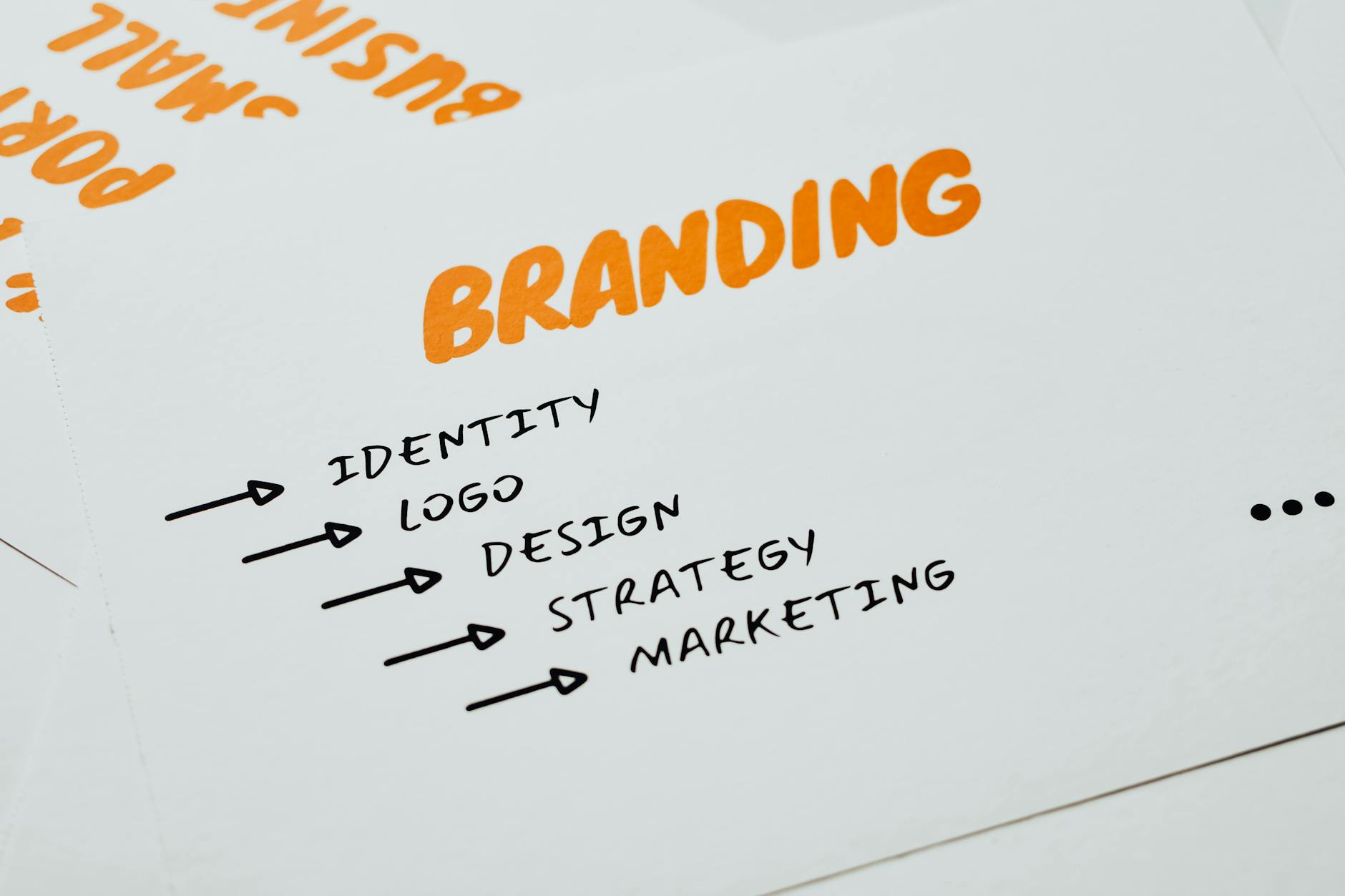
Photo by Eva Bronzini
Conclusion
A well-designed logo can significantly enhance your brand identity in the drugstore industry. By focusing on key characteristics like color psychology, symbolism, and typography, you can create a logo that resonates with your target audience. Utilize market research and customer feedback to inform your design, and consider innovative trends for inspiration. Remember, tools like the Logo Maker Shop can simplify the process, allowing you to bring your creative vision to life. Start your journey today and design a logo that not only looks great but also communicates your brand's values effectively!

Michael Harper is a Senior Content Strategist at MarketInsider.co, a premier source for insights on digital marketing and business trends. With over 15 years of expertise in content development and strategic communications, Michael is renowned for his ability to craft compelling narratives that resonate with diverse audiences. He holds a Bachelor’s degree in Journalism from New York University and a Master’s degree in Business Administration from Columbia Business School. Outside of work, Michael is passionate about historical literature and enjoys hiking the trails of the Pacific Northwest.


