Disposable Diapers Industry Logo Design Ideas
A well-crafted logo serves as the face of your brand, especially in the disposable diapers industry. It's not just a visual identity; it communicates your brand's values, quality, and appeal to your target audience. When parents choose diapers for their children, they don't just look for functionality—they seek brands they can trust. This makes a strong logo essential for brand recognition and loyalty.
Understanding the Disposable Diapers Market
Target Audience
Your primary audience comprises parents and caregivers, who prioritize health, comfort, and convenience. Crafting a logo that resonates with them involves understanding their concerns. A logo must evoke feelings of safety, reliability, and warmth. Additionally, consider grandparents and gift-givers who might choose diapers for their loved ones.
Current Market Trends
In the disposable diaper market, trends often emphasize sustainability and eco-friendliness. Many brands are shifting towards biodegradable materials, which can be a powerful selling point. Logos that reflect these values—like incorporating green colors or natural symbols—can greatly resonate with modern consumers looking for environmentally responsible choices.
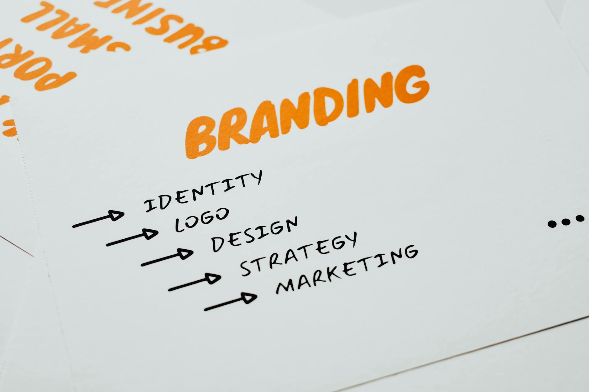
Photo by Eva Bronzini
Key Characteristics of Effective Diaper Logos
Color Psychology
Colors play a pivotal role in logo design. In the diaper industry, soft pastels like light blue, pink, and yellow convey gentleness and care. These colors resonate with parents looking for products suitable for their babies. Green shades, on the other hand, symbolize eco-friendliness and can help establish a brand as sustainable.
Shape and Symbolism
Shapes communicate messages without words. For diaper logos, soft, round shapes can indicate comfort and safety. Using symbols like a baby’s footprint or a gentle cloud can evoke emotions tied to parenting. Be sure your logo reflects these themes, as they closely align with your audience's aspirations and values.
Typography Choices
When it comes to fonts, simplicity is key. Opt for friendly, rounded sans-serifs that are easy to read. The typeface should embody warmth and approachability—qualities that parents seek in the brands that cater to their children’s needs.
Ideation Techniques for Diaper Logos
Researching Competitors
Before diving into the design process, analyze competitor logos to identify what works and what doesn’t. This can inspire your vision while ensuring you stand out in the marketplace. Take note of common themes, colors, and fonts, and ask yourself how you can bring something unique to the table.
Utilizing Design Templates
Using design templates can simplify your creation process. Platforms like Logo Maker Shop offer a variety of customizable templates that suit your audience's preferences. This can save you time and ensure your logo maintains a professional appearance.
Trends in Logo Design for Disposable Diapers
Minimalism and Simplicity
Today’s consumers often prefer cleaner, minimalist designs. Simple logos tend to be more flexible across various platforms, ensuring consistency. This trend also allows your brand to appear modern and sophisticated, without overwhelming the viewer.
Playful and Fun Designs
Fun elements can appeal directly to your target audience. Incorporate playful illustrations, cartoon characters, or fun patterns that evoke joy and creativity. This can make your brand more relatable and engaging for both parents and children.
Eco-Friendly Branding
As parents become more eco-conscious, brands that emphasize sustainability can greatly benefit. Consider adopting green themes in your logo that reflect your commitment to environmentally friendly practices. Colors, typography, and even symbols can reinforce this message, making your brand stand out in a crowded marketplace.
Case Studies: Successful Diaper Logos
Case Study: Brand A
Brand A's logo strategically uses pastel colors and a gentle font. The inclusion of a small baby icon adds to the warmth and approachability of the brand. This logo effectively communicates reliability, which resonates well with parents looking for trustworthy diaper choices.
Case Study: Brand B
Brand B’s logo stands out with a bold, playful font and vibrant colors. The use of cartoon characters in their branding not only draws attention but also makes the brand memorable for children. This playful aesthetic invites engagement, appealing to both parents and young kids.
Creating Your Diaper Logo with Logo Maker Shop
Step-by-Step Process
Creating a compelling logo is straightforward with Logo Maker Shop. Here's how you can get started:
- Choose Your Template: Navigate through a wide array of templates that suit the disposable diaper industry.
- Customize the Design: Adjust colors, fonts, and icons to match your brand identity.
- Get Feedback: Share your design with peers or potential customers to gather constructive feedback.
- Finalize and Download: Once you're satisfied, download your logo in various formats for use on different platforms.
Tips for Customization
Think about what makes your brand unique. Personalize your logo with elements that reflect your story. Whether it’s a specific color palette or distinct typography, make sure to incorporate these traits into your design. Always keep your target audience in mind as you customize—ensure they see something they connect with in your brand.
Conclusion
A well-designed logo in the disposable diapers industry is vital for achieving recognition and fostering consumer trust. By focusing on effective design elements like color psychology, shapes, and typography, you can create a logo that resonates with parents and caregivers alike. Harness your creativity and explore various design strategies, including using tools like Logo Maker Shop, to develop a unique visual identity that stands out in the market. Remember, a strong logo isn't just art—it's the foundation of your brand's identity.

Michael Harper is a Senior Content Strategist at MarketInsider.co, a premier source for insights on digital marketing and business trends. With over 15 years of expertise in content development and strategic communications, Michael is renowned for his ability to craft compelling narratives that resonate with diverse audiences. He holds a Bachelor’s degree in Journalism from New York University and a Master’s degree in Business Administration from Columbia Business School. Outside of work, Michael is passionate about historical literature and enjoys hiking the trails of the Pacific Northwest.


