Asymmetrical Style Logo Design Ideas
As businesses strive for unique branding, asymmetrical logos have surged in popularity. This modern design trend offers a refreshing departure from traditional symmetries. Asymmetrical logos tell a story of innovation and personality and capture attention in a way that symmetrical designs often can't. Whether you’re an entrepreneur or a small business owner, understanding this trend can set your brand apart in a crowded marketplace.
Understanding Asymmetrical Style in Logo Design
Asymmetrical style in logo design involves creating a visual balance without dividing the design into mirrored halves. Unlike traditional symmetrical logos that rely on balance through uniformity, asymmetrical designs create intrigue by distributing visual elements unevenly. This tension can lead to unique, memorable brand identities that stand out at first glance.
Key Characteristics of Asymmetrical Logos
When looking at asymmetrical logos, several defining features emerge:
-
Visual Interest: Asymmetry naturally invites curiosity and keeps the viewer's attention. The imbalance draws the eye, encouraging the audience to explore the design further.
-
Dynamic Shapes: Asymmetrical logos often utilize unexpected shapes and arrangements, creating a sense of movement that can evoke emotion or action.
-
Balanced Disparity: While they are unevenly weighted, asymmetrical logos can still achieve balance through careful placement of elements, making thoughtful use of empty space to enhance the overall design.
Importance of Asymmetry in Branding
In branding, first impressions are everything. An asymmetrical logo can enhance recognition and create strong associations with your brand. Such designs often feel fresh and innovative, suggesting that your business values creativity and a forward-thinking mindset. Asymmetry can reflect your company’s unique personality, whether you're aiming for playful, sophisticated, or avant-garde aesthetics.
Design Principles for Asymmetrical Logos
Crafting an effective asymmetrical logo involves understanding a few key design principles. Applying these concepts can elevate your logo and ensure it resonates with your target audience.
Balance and Visual Weight
Achieving balance in an asymmetrical layout involves adjusting the visual weight of the elements. Large, bold shapes can be offset by smaller, delicate features. Think of it like a seesaw—keeping that balance is crucial, even when the design isn't equal on both sides. This balance will guide the viewer's eye and reinforce your logo's power.
Color and Typography Choices
Effective use of color can bring life to an asymmetrical design. Bold palettes create energy, while muted tones offer sophistication. Additionally, choosing the right typography is vital. Playful fonts or clean, minimalist typefaces can dramatically shift the logo's character and enhance its appeal.
Incorporating Negative Space
Negative space is your ally in asymmetrical designs. This area isn’t just empty; it helps define shapes and creates meaningful visual connections. A clever use of negative space can imbue your logo with subtler meanings and enhance your viewer's experience.
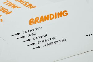
 Photo by Rod Shelley
Inspiration and Case Studies
Diving into existing asymmetrical logos can spark creativity and provide insight into successful design strategies.
Trends in Asymmetrical Logo Design
Current trends in asymmetrical logos lean towards minimalism combined with bold elements. Colors are often vibrant, and the shapes used can be organic or geometric—whatever captures the brand's essence best.
Case Studies of Innovative Asymmetrical Logos
Several brands have embraced asymmetrical designs to great effect. Take the logo for FedEx: the clever use of negative space creates an arrow in the letters, subtly reinforcing the brand's focus on efficiency and forward motion. Another example is Nike, which utilizes a simple yet effective asymmetrical swoosh that is instantly recognizable across the globe. These logos work because they immediately convey their respective brands' messages.
Creating Your Asymmetrical Logo
Designing your asymmetrical logo can be a fulfilling and creative process. Here’s a guide to help you start.
Step-by-Step Design Process
- Brainstorm Ideas: Jot down words that represent your brand's essence. Visualize how those can translate into shapes or symbols.
- Sketch: Use rough sketches to explore different layouts and configurations. Don't strive for perfection; focus on expressing your ideas.
- Select Elements: Choose colors, shapes, and typography that resonate with your brand message.
- Use Design Tools: There are excellent resources available online, such as the Logo Maker Shop, which can help you iteratively design and refine your logo.
Utilizing Logo Maker Shop Tools
The Logo Maker Shop offers user-friendly tools to create your logo quickly and effectively. With access to templates, colors, and fonts, you can bring your vision to life without needing extensive design knowledge.
Final Thoughts on Asymmetrical Style Logo Design Ideas
Asymmetrical logos offer an avenue for creativity, allowing brands to express uniqueness and personality. By employing thoughtful design principles and exploring inspirational examples, you can craft a compelling logo that captures the essence of your business. Asymmetrical logos are not just visually stunning; they can also be strategic assets for effective branding.
In conclusion, don’t hesitate to experiment with your designs! With platforms like the Logo Maker Shop at your disposal, the opportunity to create a unique asymmetrical logo is right at your fingertips. Embrace the creativity, and let your brand's identity shine through!

Michael Harper is a Senior Content Strategist at MarketInsider.co, a premier source for insights on digital marketing and business trends. With over 15 years of expertise in content development and strategic communications, Michael is renowned for his ability to craft compelling narratives that resonate with diverse audiences. He holds a Bachelor’s degree in Journalism from New York University and a Master’s degree in Business Administration from Columbia Business School. Outside of work, Michael is passionate about historical literature and enjoys hiking the trails of the Pacific Northwest.

