Accessibility Testing Industry Logo Design Ideas
Logos are more than just images; they represent a brand's mission and values, particularly in specialized fields like accessibility testing. A well-designed logo can encapsulate what a business stands for and signal to your audience that you are committed to creating equitable digital experiences. The right logo not only improves brand recognition but also enhances trust, making it essential for businesses in the accessibility testing industry.
Understanding the Accessibility Testing Industry
Defining Accessibility Testing
Accessibility testing refers to the process of ensuring that digital content is available and usable for individuals with disabilities. This can include assessing websites, applications, and other digital platforms to confirm they comply with guidelines set forth by standards such as the Web Content Accessibility Guidelines (WCAG). In today’s environment, where digital presence is pivotal, accessibility testing has become increasingly significant, ensuring that everyone, regardless of their abilities, can navigate the digital landscape easily.
Key Players in the Industry
Several organizations play crucial roles in the accessibility testing landscape:
- W3C (World Wide Web Consortium): They develop international standards for the web, including WCAG.
- WebAIM (Web Accessibility in Mind): This team focuses on providing accessibility training and services.
- Deque Systems: They offer tools and services designed to help organizations make their digital content more accessible.
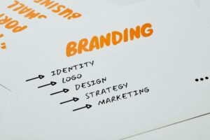
Key Characteristics of Effective Accessibility Testing Logos
Creating a logo for the accessibility testing industry involves distinct considerations. Here are some essential features that these logos must embody.
Simplicity and Clarity
A great logo in this industry must be straightforward and uncluttered. Avoid complex designs that could confuse the viewer. Simple logos tend to be more memorable and can be reproduced easily across various media.
Incorporating Universal Symbols
Using recognizable symbols is essential. Universal symbols, such as the wheelchair icon, resonate well with audiences and immediately communicate the theme of accessibility. This instant recognition can enhance understanding and foster connections with potential clients.
Color Scheme Considerations
Color choice greatly affects visibility and brand perception. Opt for colors that not only reflect your brand values but also comply with accessibility standards. For instance, high-contrast colors can improve visibility for people with visual impairments.
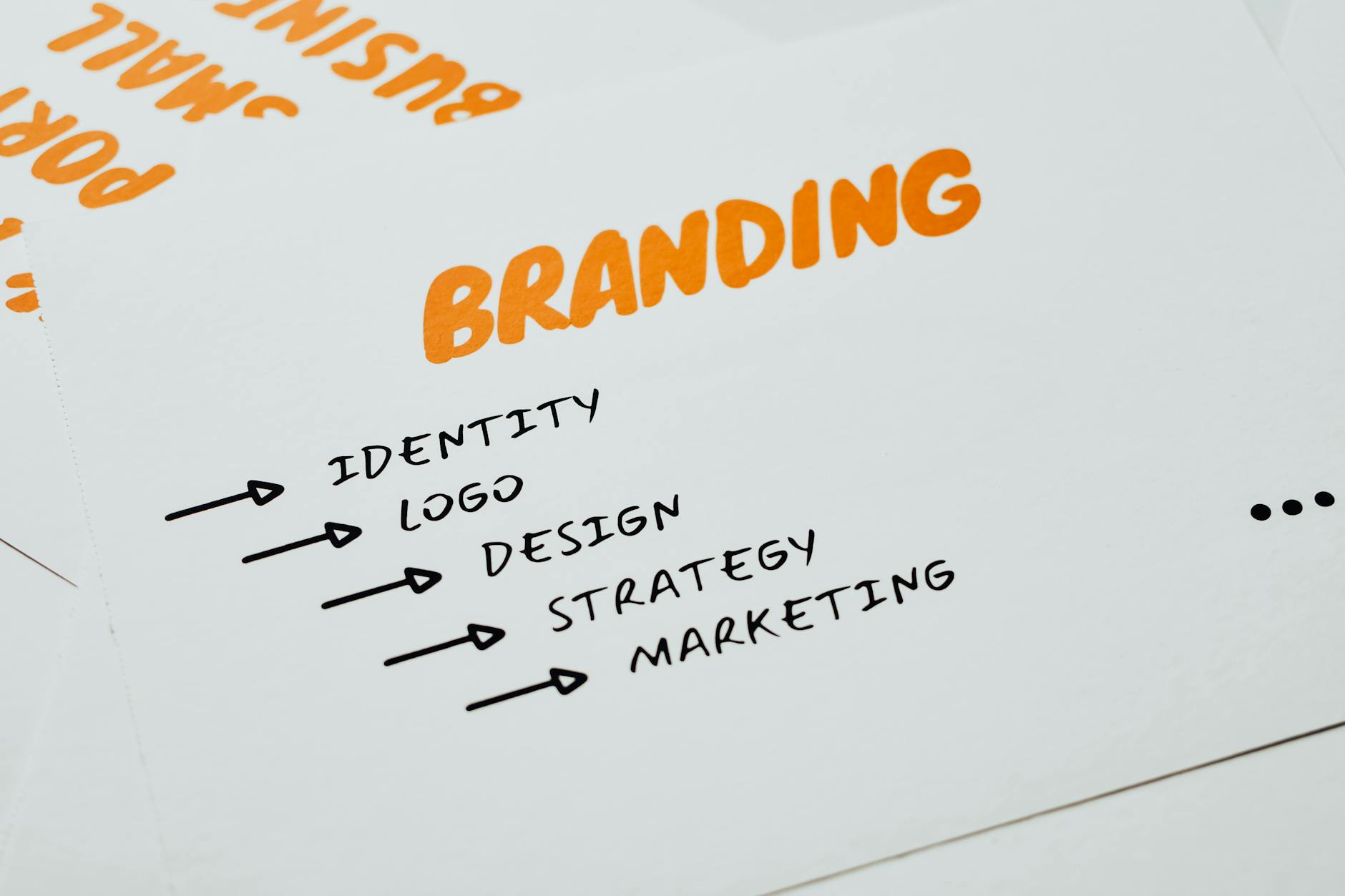
Photo by Eva Bronzini
Ideation Techniques for Accessibility Testing Logos
Developing a logo concept is an exciting part of the design process. Here are some practical strategies to inspire your creativity.
Conducting Market Research
To stand out, you need to understand the competition. Analyzing competitors and identifying industry trends can guide your design decisions. Look for common themes but strive to innovate rather than replicate.
Creating Mood Boards
Mood boards are fantastic tools for visualizing ideas and themes. Collect images, colors, and typography that resonate with your brand’s values. This collage of inspiration can help steer your logo design in the right direction.
Sketching and Prototyping
Don’t underestimate the power of hand-drawn sketches! They allow you to explore ideas freely before committing to digital versions. Prototyping digitally further helps visualize how your logo will look online or in print.
Inspiration from Successful Accessibility Testing Logos
Examining successful logos can provide valuable insights and inspire your designs.
Case Study: Iconic Brands
Look at brands like Deque Systems. Their logo reflects simplicity and clarity, using universal symbols that resonate with their mission. Analyzing why certain logos work can offer deep understanding of effective design.
Visual Trends to Consider
Current trends emphasize minimalism and fluid designs. Such aesthetics resonate well within the accessibility testing industry since they convey a sense of ease and straightforwardness.
Feedback and Iteration
Don’t overlook the importance of gathering feedback during your design process. Constructive criticism can illuminate areas for improvement, ensuring that your logo achieves its intended purpose.
Tips and Best Practices for Designing Accessibility Testing Logos
Here are some actionable tips to help finalize your logo design:
Testing for Accessibility
Make sure your logo meets accessibility standards. Tools available online can help assess whether your logo is legible and comprehensible when viewed by individuals with disabilities.
Keeping It Versatile
Your logo will appear across numerous mediums—from business cards to websites. Ensure that it maintains its impact regardless of where it’s displayed.
Engaging with Stakeholders
Involve key stakeholders in your design process. Their insights can prove invaluable and help create a logo that authentically represents the organization.
Conclusion
A thoughtfully designed logo is instrumental within the accessibility testing industry. It not only embodies your mission but also helps to build trust with your audience. If you’re ready to embark on your logo design journey, consider using the Logo Maker Shop to guide you. This user-friendly platform ensures you create a logo that resonates with your audience and aligns with your values.
For further reading on how to create impactful logos, check out this guide.

Michael Harper is a Senior Content Strategist at MarketInsider.co, a premier source for insights on digital marketing and business trends. With over 15 years of expertise in content development and strategic communications, Michael is renowned for his ability to craft compelling narratives that resonate with diverse audiences. He holds a Bachelor’s degree in Journalism from New York University and a Master’s degree in Business Administration from Columbia Business School. Outside of work, Michael is passionate about historical literature and enjoys hiking the trails of the Pacific Northwest.

