What is Visual Balance?
When you think about design, what comes to mind? Is it the colors, shapes, or maybe the typography? One crucial element that often goes unnoticed yet plays a pivotal role is visual balance. It’s the secret sauce that keeps everything from feeling chaotic and overwhelming. Visual balance is about achieving harmony in a design, ensuring that no single part overpowers the others. This balance influences how viewers perceive and interact with your work, making it an essential aspect of successful design.
Understanding Visual Balance
The Concept of Balance in Design
Visual balance in design refers to the distribution of elements in a way that makes a composition feel stable and pleasing to the eye. This concept is akin to a seesaw where balance is achieved when both sides hold equal weight. In design, balance can be symmetrical, where elements are mirrored across a central axis, or asymmetrical, where different elements carry equal visual weight but aren’t identical.
Symmetry is the easiest form of balance, providing a sense of calmness and order. Asymmetry, on the other hand, offers more dynamism and interest, often resulting in more visually engaging compositions. To dive deeper into these principles, you might find this guide on symmetrical and asymmetrical balance insightful.
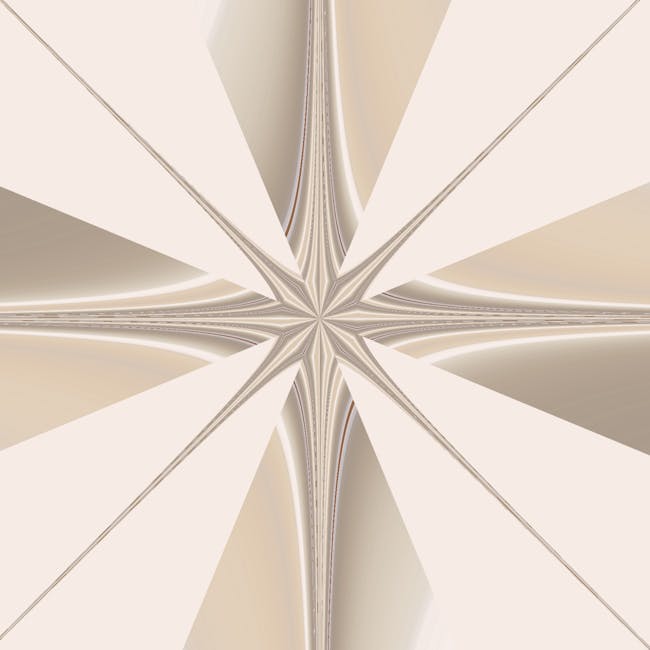
Types of Visual Balance
Understanding the types of visual balance can enhance your design’s effectiveness:
-
Symmetrical Balance: This is all about mirroring elements on either side of a central line. Think of a butterfly’s wings or a balanced scale.
-
Asymmetrical Balance: Here, balance is achieved through contrast. Different elements are used to create a visual balance without mirroring, like placing a heavy object close to the center and a lighter one far from it.
-
Radial Balance: Imagine a sunflower. Radial balance arranges elements around a central point, radiating outward evenly.
For more on how balance functions in design, visit this article.
Implementing Visual Balance in Brand Design
The Importance of Balance in Branding
In branding, visual balance is a powerful ally. A balanced logo or brand design can convey trust and professionalism. It ensures that no single element overshadows the brand’s identity, allowing for clearer and more impactful communication. Brands that master balance often enjoy greater recognition and consumer trust. For a comprehensive understanding of how balance affects design, check out this resource.
Case Studies in Branding and Visual Balance
Successful brands often utilize visual balance to great effect. Take, for example, the iconic Apple logo. Its simplicity and symmetry evoke a sense of innovation and trustworthiness. Similarly, the Nike swoosh uses asymmetrical balance to convey movement and dynamism, reflecting the brand’s ethos. By studying these examples, you can see how balance in design isn’t just about aesthetics—it’s about conveying the right message.
Techniques for Achieving Visual Balance
Use of Color and Space
Color and space are crucial tools in achieving visual balance. Colors can attract attention, direct focus, or evoke emotions, while space, especially white space, can give a design room to breathe. The strategic use of these elements can guide viewers through a design in an intentional way. For more tips on using color and space, this guide is a great starting point.
Typography and Visual Weight
Typography isn’t just about picking a pretty font. Different typefaces carry different weights and can significantly affect a design’s balance. A bold, heavy font might demand more attention and can balance out a lighter, softer image. Understanding how typography affects visual weight can help create a balanced and professional design.
Common Mistakes to Avoid
Overloading with Elements
It’s tempting to cram as much information as possible into a design. However, overloading can lead to clutter and chaos, disrupting balance. Less is often more, and removing unnecessary elements can enhance the viewer’s experience and improve the overall balance.
Ignoring Hierarchy
Visual hierarchy guides viewers through a design in a logical order. Ignoring this can lead to confusion and imbalance. Establishing a clear hierarchy ensures that viewers focus on the most important elements first, maintaining balance and clarity.
Conclusion
Visual balance is more than just an aesthetic principle—it’s a fundamental aspect of effective design. By understanding and applying balance, whether through color, typography, or layout, you can create designs that not only look good but communicate effectively. Remember, a well-balanced design is like a well-told story, leading the viewer seamlessly from one element to the next, making for an engaging and memorable experience.
 Photo by byMALENS