What is Photoshop Color Saturation?
Photoshop color saturation is more than just a tool; it’s a vital component in the toolkit of any designer. Whether you’re working on an eye-catching logo or a stunning brand visual, understanding and mastering saturation can make all the difference. It’s about making those colors pop just the right way, reflecting the essence and identity of a brand. But what exactly is color saturation, and how can it transform your design work? Let’s explore!
Understanding Color Saturation in Photoshop
Definition of Color Saturation
Saturation refers to the intensity or purity of a color. In Photoshop, it’s the measure of how much a hue deviates from gray. More saturation means more vivid, vibrant colors, while less saturation leads to muted, dull tones. It’s akin to the volume dial on your stereo; crank it up, and the hues sing out loud.
Effects of Saturation on Image Quality
Saturation affects not just the color itself but the entire vibe of an image. Increased saturation enhances brightness and vibrancy, while too much can lead to unnatural and jarring visuals. On the flip side, desaturation can evoke a sense of calm, clarity, and sometimes nostalgia. The balance of saturation can make or break the emotional impact of your visuals. For further insights, check out this guide on color theory to see how saturation affects perception and mood.
How to Adjust Color Saturation in Photoshop
Using the Hue/Saturation Adjustment Layer
The Hue/Saturation adjustment layer is a powerhouse in Photoshop. To create one, select Layer > New Adjustment Layer > Hue/Saturation. This tool lets you tweak not just the saturation but also the hue and lightness of individual colors. Imagine it as a painter’s palette where you can mix and match to create the perfect shade.
To learn more about using this tool, Adobe’s official guide is a great resource.
Utilizing the Vibrance Tool
The Vibrance tool is a gentler way to adjust saturation. Unlike the straightforward saturation slider, Vibrance focuses on the less saturated parts of an image, bringing them up without blowing out colors that are already vivid. It’s like adding seasoning to a dish; just the right amount enhances the flavor without overwhelming the palate.
Check out this tutorial to see how Vibrance differs and why it might be the perfect choice for subtle adjustments.
Best Practices for Using Color Saturation in Brand and Logo Design
Choosing the Right Saturation Levels
When it comes to branding, saturation levels must align with the brand’s personality. A tech brand might opt for sharp, saturated blues, while an eco-friendly company might prefer soothing, desaturated greens. The key is to reflect the brand’s ethos through color. Understanding the meaning of colors can help in choosing the right saturation levels.
Understanding Audience Perception of Color Saturation
Different audiences perceive color saturation in varying ways. Younger audiences might be drawn to bold, saturated colors, while a more mature demographic might appreciate muted tones. Knowing your target audience is crucial in choosing saturation that resonates with them. This color theory guide offers insights into how color affects perception.
Common Mistakes to Avoid when Adjusting Color Saturation
Over-Saturating Images
Over-saturation is like turning the volume too high on a stereo; it can be overwhelming and unpleasant. It often leads to loss of detail and unnatural colors. Keeping it balanced ensures your design remains tasteful and professional. To avoid this pitfall, use tools like Vibrance for more controlled adjustments.
Neglecting Color Harmony
Saturation changes shouldn’t disrupt the harmony of colors within a design. Just like in music, where notes must blend together smoothly, colors must complement each other. Keeping an eye on the overall color scheme ensures the design feels cohesive. Color harmony is essential for a pleasing aesthetic.
Conclusion
Photoshop color saturation is a powerful tool in the hands of a designer. From enhancing the vibrancy of a logo to setting the mood of a brand image, mastering saturation is crucial for creating impactful visuals. By understanding its effects, using the right tools, and avoiding common mistakes, you can elevate your design work and create visuals that truly resonate with your audience. Saturation isn’t just about color; it’s about storytelling through design.
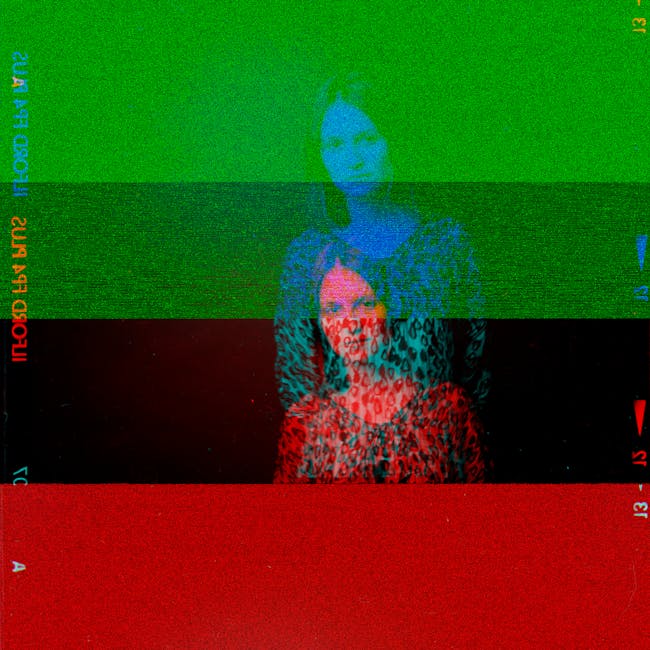
 Photo by Alexey Demidov