Lighting Equipment Industry Logo Design Ideas
In the dynamic realm of the lighting equipment industry, a strong logo isn’t just a pretty picture; it’s a visual ambassador for your brand. Think of it as the torchlight guiding potential customers through the maze of choices, illuminating your unique offerings. A well-crafted logo reflects your business's identity, values, and the quality of your products. Let’s explore what makes an effective logo in this sector and how you can create one that stands out.
Key Characteristics of Lighting Equipment Logos
To create an impactful logo, it's essential to understand the key characteristics defining effective designs in the lighting equipment industry.
Use of Color
Color choice plays a pivotal role in logo design. In the lighting sector, colors like warm yellows and cool blues can evoke feelings of warmth and stability. Bright colors can mimic the energy of light, while muted tones may suggest sophistication. Your color palette should align with the emotions you want to convey. For example, a vibrant yellow might communicate innovation, while a deep blue could suggest reliability.
Imagery and Icons
Common imagery in lighting logos includes symbols like light bulbs, beams of light, and intricate technical icons. Using recognizable imagery not only makes the logo relatable but also immediately conveys the nature of your business. Think about how you can incorporate elements of your products into your logo. A minimalist bulb silhouette or a sleek beam of light can serve as a memorable focal point that resonates with your audience.
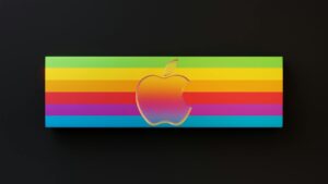
 Photo by Ken Chuang
Typography Choices
The font you choose is more than just a style; it represents your brand's voice. Clean, modern fonts often work well in the lighting industry, conveying a sense of professionalism and innovation. The right typography should be legible and easily adaptable across various mediums. A playful typeface might suit a company specializing in decorative lights, whereas a bold, straightforward font aligns with an industrial lighting manufacturer.
Ideation Techniques for Logo Design
Once you grasp the characteristics of effective logos, it’s time to brainstorm your ideas.
Researching Competitors
Start by analyzing logos from existing companies in your niche. What aspects do they excel at? What common themes or color schemes recur? Understanding your competitors can provide inspiration and help you identify gaps in their designs that you can fill with your unique concept.
Sketching Concepts
Before you settle on one design, grab a pencil and paper and start sketching multiple ideas. Sketching allows for creativity to flow freely without the constraints of digital tools. You might find that an initial idea evolves into something far more innovative as you play around with shapes and layouts.
Utilizing Logo Maker Shop
Creating a logo doesn’t have to be complicated. The Logo Maker Shop offers easy-to-use tools to design your logo in minutes. With template options and customizations, you can quickly go from idea to implementation without needing extensive design skills. It's efficient and helps you visualize your concepts instantly.
Inspiring Trends and Innovations in Logo Design
Staying updated with the latest trends can significantly enhance your logo's appeal.
Minimalistic Designs
Simplicity is key in today's branding landscape. Minimalistic logos are often more memorable and versatile. They translate well across various applications, from business cards to large signage. A well-designed, simple logo allows your customers to recognize your brand at a glance.
Dynamic and Interactive Elements
Consider incorporating dynamic aspects into your logo, such as animations for digital platforms or 3D elements that pop in print. Lighting equipment naturally lends itself to innovation—let this reflect in your logo by creating an engaging and lively design.
Sustainable Design Practices
With a rising emphasis on sustainability, incorporating eco-friendly elements into your logo can resonate well with today’s conscious consumers. Whether it’s through the use of organic shapes or green color palettes, showcasing your commitment to the environment can enhance brand loyalty.
Successful Case Studies in Lighting Equipment Logos
Looking at successful logos can provide insights and inspiration for your own design.
Case Study 1: Company A
Company A utilizes a sleek, modern font paired with an icon depicting a stylized light bulb. The effective use of vibrant yet balanced color gives a sense of energy without overwhelming the viewer. This logo has successfully positioned the company as a leader in the innovative lighting space.
Case Study 2: Company B
Company B’s logo showcases a unique blend of typography and imagery, combining an abstract beam of light with a minimalist typeface. This design not only reflects their focus on quality and precision but also differentiates them from competitors, making it instantly recognizable.
Practical Tips for Designing Your Own Logo
Creating your own lighting equipment logo can be a rewarding process. Here are some practical tips to guide you.
Keep It Simple and Relevant
A good logo should be straightforward and connected to your brand. Avoid clutter and unnecessary details. A clean design ensures your message is clear and effectively communicates what your brand stands for.
Gather Feedback from Peers
Once you've drafted your logo, seek feedback from colleagues or friends. Fresh eyes can spot areas for improvement that you might miss. This collaborative approach can refine your logo to perfection.
Using Logo Maker Shop Resources
To enhance your design process, check out the resources available at the Logo Maker Shop. The blog provides valuable insights on logo creation, ensuring you have the right tools to bring your vision to life.
In conclusion, designing a logo for the lighting equipment industry is about capturing your brand’s essence in a way that resonates with your audience. By understanding the characteristics of effective logos, employing creative ideation techniques, and staying abreast of current trends, you can create a logo that not only stands out but also serves as a vital connection between your brand and its customers. So, grab those pencils, explore your ideas, and let your creativity shine!

Michael Harper is a Senior Content Strategist at MarketInsider.co, a premier source for insights on digital marketing and business trends. With over 15 years of expertise in content development and strategic communications, Michael is renowned for his ability to craft compelling narratives that resonate with diverse audiences. He holds a Bachelor’s degree in Journalism from New York University and a Master’s degree in Business Administration from Columbia Business School. Outside of work, Michael is passionate about historical literature and enjoys hiking the trails of the Pacific Northwest.

