Legal Typing Industry Logo Design Ideas
In the legal typing industry, having a distinct logo isn't just a matter of aesthetics; it's a crucial element that reflects your brand identity. A well-designed logo helps you stand out in a competitive field and convey trust and professionalism to potential clients. As you delve into the world of logo design, understanding effective strategies can guide you in creating a memorable mark that resonates with your target audience.
Key Characteristics of Effective Legal Typing Logos
Professionalism and Authority
When you think of legal services, qualities like professionalism and authority come to mind. Your logo should mirror these characteristics through thoughtful design choices. Opt for clean lines and refined typography that exudes confidence. A logo that appears too whimsical may undermine your credibility, while a straightforward design can reinforce your industry’s gravitas.
Simplicity and Clarity
In the legal typing industry, simplicity is your ally. A clean, uncluttered logo allows for quick recognition and easy recall. Think about it: when clients first see your logo, what do you want them to remember? Use a minimalistic approach, focusing on essential elements that communicate your services. A simple logo avoids confusion and ensures that your brand message is clear.
Color Psychology in Legal Branding
Colors evoke emotions and influence perceptions. In legal branding, colors like blue, black, and gray are commonly associated with trust, authority, and stability. Blue, in particular, conveys competence and dependability. Consider using a primary color palette that resonates with these positive emotions, laying the groundwork for trust with your clients.

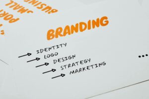
Photo by Canva Studio
Inspirational Logo Design Ideas for the Legal Typing Industry
Integration of Legal Symbols
Using recognizable legal symbols can be an effective way to anchor your logo in the legal industry. Symbols like scales of justice, gavels, or law books can quickly communicate the essence of your work. However, integrate these symbols in a subtle way to avoid overwhelming your design. A well-placed icon can enhance recognition without dominating your logo’s visual hierarchy.
Typography Choices
Font selection plays a pivotal role in how clients perceive your brand. Serif fonts often evoke feelings of tradition and reliability, making them a popular choice for legal logos. On the other hand, sans-serif fonts might suggest a modern approach. Choose a typeface that aligns with your brand values. Remember, clarity is key in typography—your clients should be able to read your logo effortlessly.
Case Studies: Successful Legal Logos
Looking at successful examples can ignite your creativity. For instance, the logo of a well-known law firm may use a simple yet bold font paired with an elegant scale symbol. This combination not only makes the firm instantly recognizable but also communicates assurance. Study various logos from different firms—what do they communicate? Identify what you like and explore how to incorporate similar thoughts into your design.
Practical Tips for Designing Your Legal Typing Logo
Using the Logo Maker Shop
Creating a professional logo can be a straightforward process with the right tools. The Logo Maker Shop allows you to design your logo in just minutes. You can choose from a range of templates tailored for legal businesses, ensuring that you start on the right foot. With customization options at your fingertips, crafting a logo that embodies your brand's identity is easier than ever.
Iterative Design Process
Logo design doesn't have to be a one-and-done task. Embrace an iterative design process where you refine your logo based on feedback. Show your preliminary designs to friends or colleagues and ask for their impressions. This can uncover insights you may have missed and lead to a final product that's truly representative of your brand.
Testing Your Logo Concept
Once you've finalized your design, test it across different mediums. Your logo should look great on business cards, websites, and social media. Consider how the colors and shapes interact in varying sizes. A logo that’s versatile can adapt as your brand grows, making it an invaluable asset in your marketing arsenal.
Conclusion
Creating a logo for your legal typing business is an exciting opportunity to express your brand's identity. By focusing on key characteristics like professionalism, simplicity, and effective color psychology, you can design a logo that stands out. Use practical tools like the Logo Maker Shop to empower your creative process.
Final Thoughts on Legal Typing Industry Logos
Now that you’re equipped with insights and practical tips, it’s time to start designing your logo. Explore your options, experiment with different ideas, and don’t hesitate to think outside the box. Your logo is an essential part of your legal typing identity, so take the time to make it impactful.

Michael Harper is a Senior Content Strategist at MarketInsider.co, a premier source for insights on digital marketing and business trends. With over 15 years of expertise in content development and strategic communications, Michael is renowned for his ability to craft compelling narratives that resonate with diverse audiences. He holds a Bachelor’s degree in Journalism from New York University and a Master’s degree in Business Administration from Columbia Business School. Outside of work, Michael is passionate about historical literature and enjoys hiking the trails of the Pacific Northwest.

